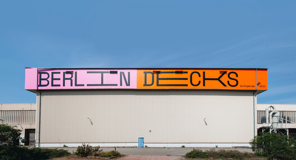
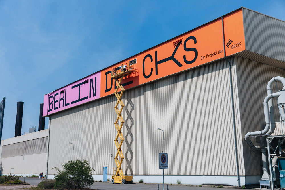
The Brief: An old industrial warehouse located directly on the Spree Canal in Berlin needed to stop blending into the background. The mission was a massive facade transformation to create a landmark visible from afar.
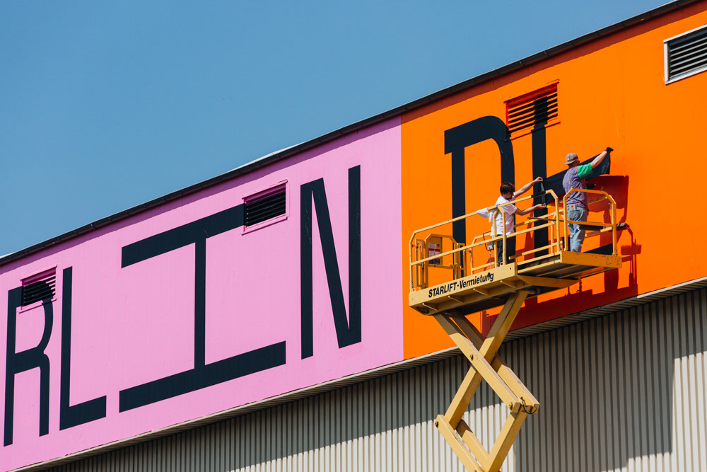
The Task: Install a gigantic logo design at a height of 15 meters that respects the raw industrial aesthetic of the building while giving it a modern twist.
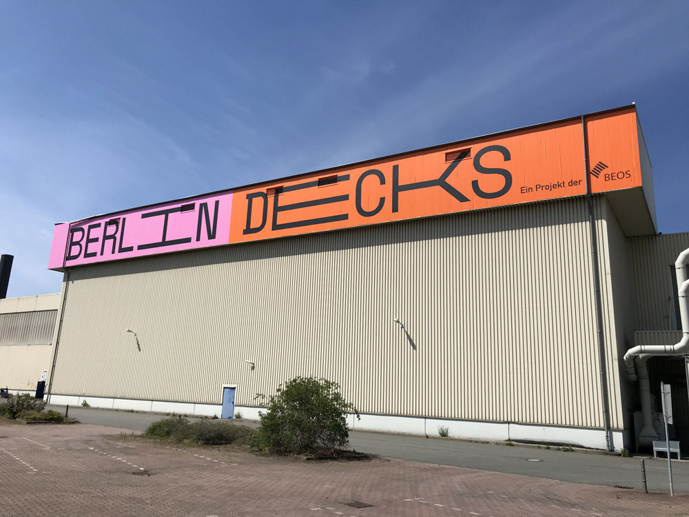
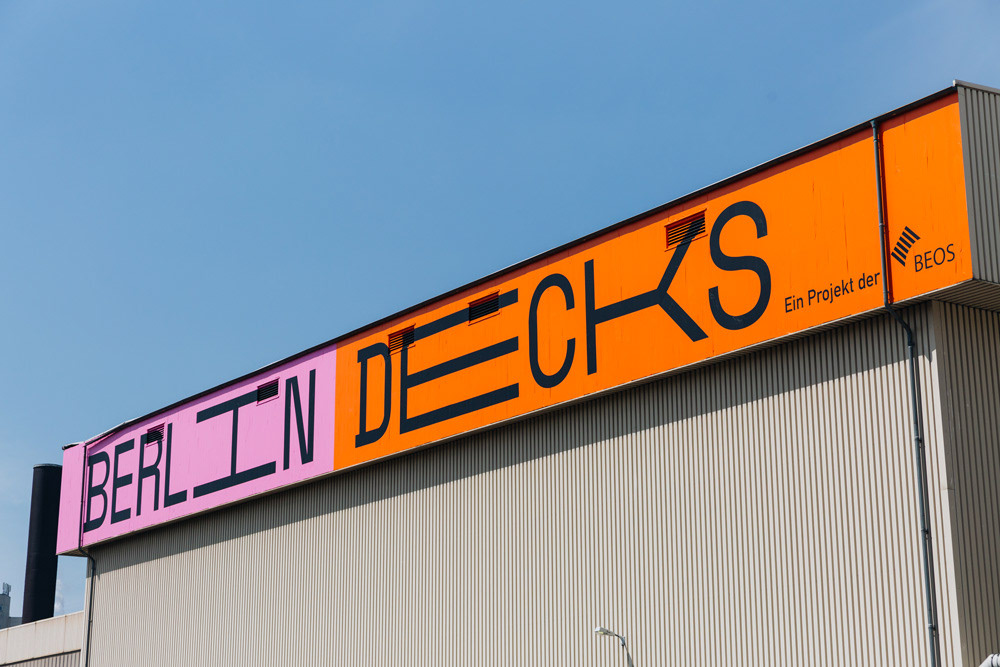
The Concept: "TYPO IN THE SKY" TAPE OVER developed a typography concept designed for maximum visibility. Instead of intricate details, we opted for a bold, block-style custom font that remains legible even from a great distance. The design fully utilizes the building's 50-meter length, turning the architecture into a communicative statement within Berlin's Urban Landscape. We looked at the skyline and taped that message right onto the horizon.
The Execution: Executing at this height and dimension was a logistical challenge. Both the letters and the background were created entirely from adhesive foils - covering over 200 square meters. The sheer scale of the project demanded absolute precision, as any deviation becomes obvious at this size. It is visual communication in XXL format: bold, weather-resistant, and inseparable from the structure. We took the brand's identity and tape that onto the city's fabric.
The Outcome: A monumental tapeart lettering piece that redefines the character of the location. The installation proves that tape art works powerfully in large-scale outdoor settings, replacing traditional signage with artistic integrity.
Das Briefing: Eine alte Industrie-Lagerhalle direkt am Spreekanal in Berlin sollte nicht mehr übersehen werden. Die Aufgabe war eine massive Fassadengestaltung, die als weithin sichtbares Wahrzeichen fungiert. In 15 Metern Höhe sollte ein gigantisches Logo Design angebracht werden, das die rohe Industrial Ästhetik des Gebäudes respektiert, aber gleichzeitig modern interpretiert.
Das Konzept: „TYPO IN THE SKY“ TAPEOVER entwickelte ein Typografie-Konzept, das auf maximale Visibility ausgelegt ist. Statt kleiner Details wurde auf einen kräftigen, blockartigen Custom Font gesetzt, der auch aus großer Entfernung lesbar bleibt. Das Design nutzt die Länge des Gebäudes (50 Meter) voll aus und verwandelt die Architektur in ein kommunikatives Statement innerhalb der Urban Landscape Berlins.
Die Umsetzung: Die Gestaltung in dieser Höhe und Dimension war eine logistische Herausforderung. Sowohl die Buchstaben als auch der Hintergrund wurden komplett aus Klebefolien gefertigt – insgesamt über 200 Quadratmeter Fläche. Die Scale des Projekts verlangte absolute Präzision, da jeder Millimeter Abweichung auf diese Distanz sichtbar wäre. Es ist Visual Communication im XXL-Format: Plakativ, wetterfest und untrennbar mit dem Gebäude verbunden.
Das Ergebnis: Ein monumentales Schriftbild, das den Charakter des Standorts neu definiert. Die Installation beweist, dass Tape Art auch im riesigen Außenbereich funktioniert und klassische Werbetechnik durch künstlerischen Anspruch ersetzen kann.