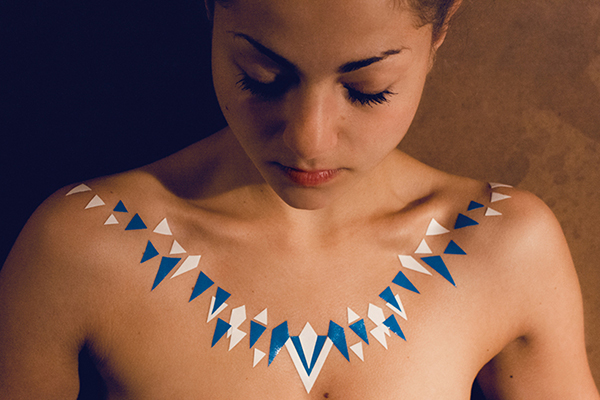
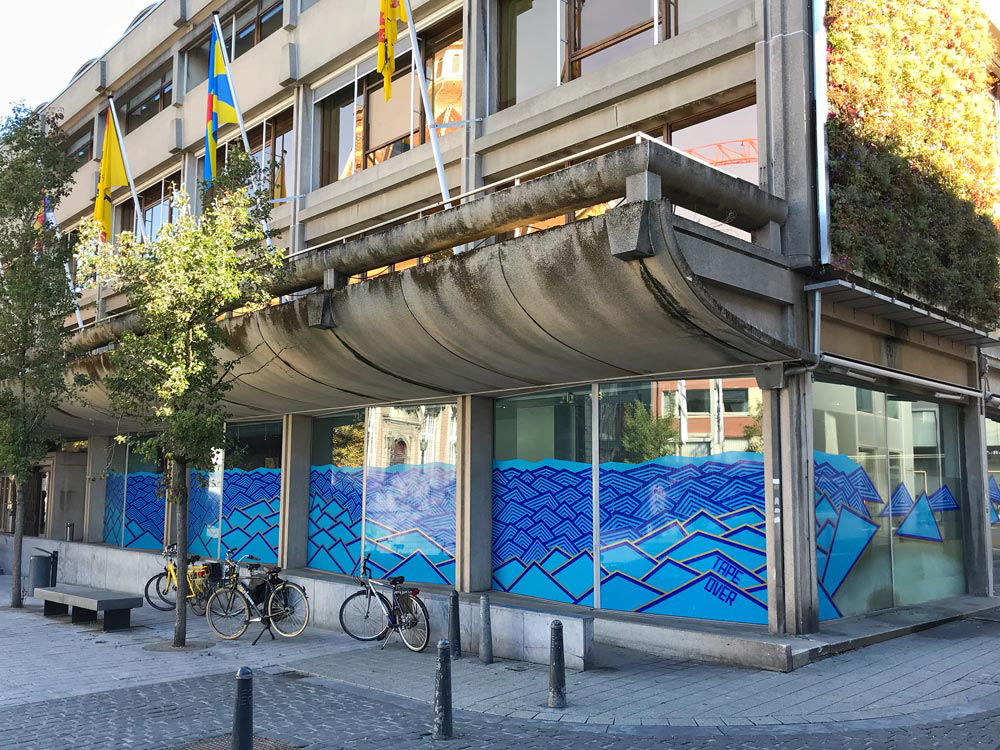
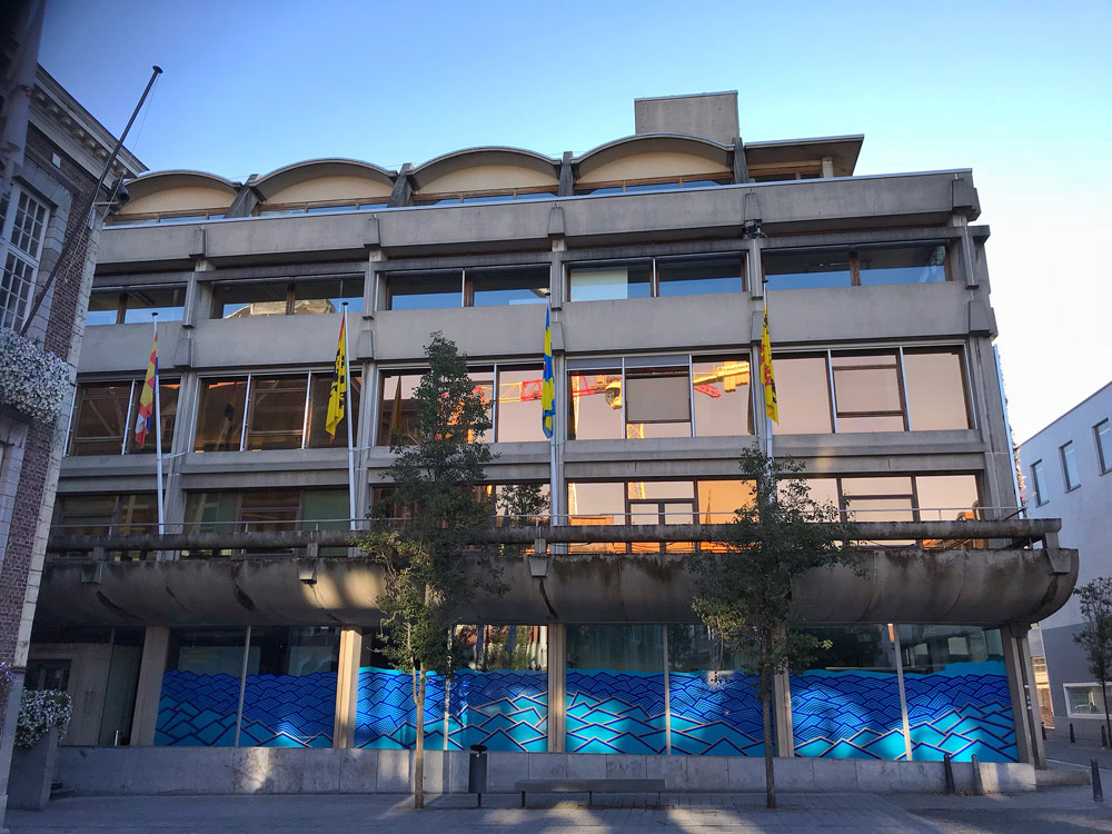
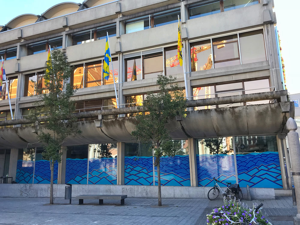
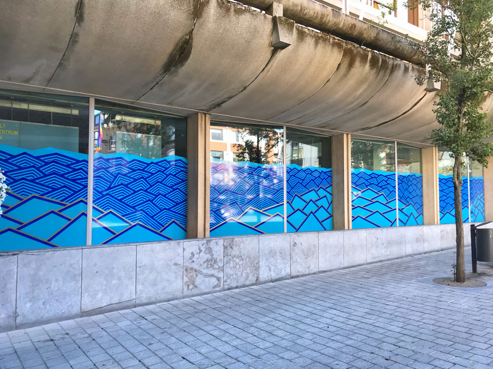
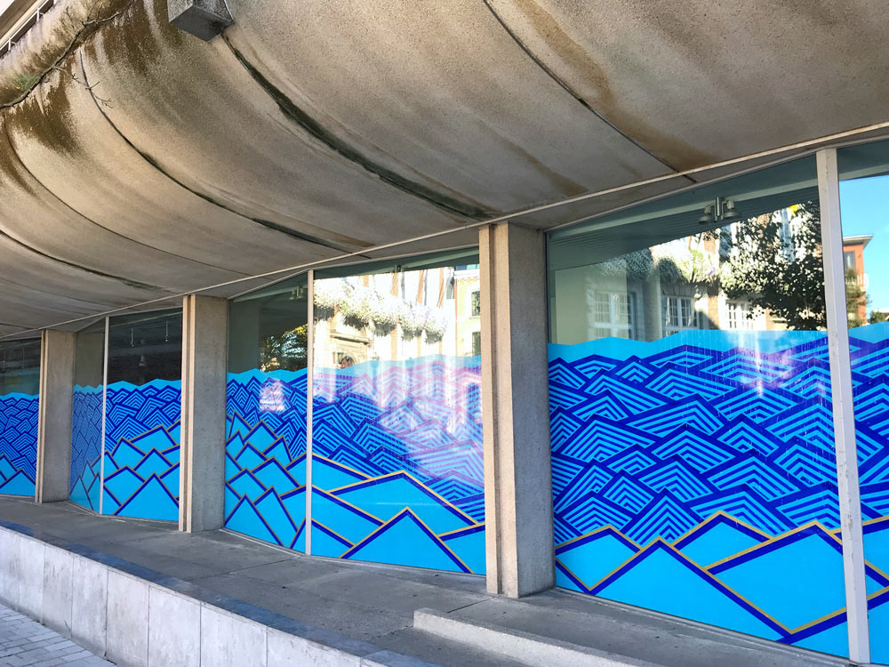
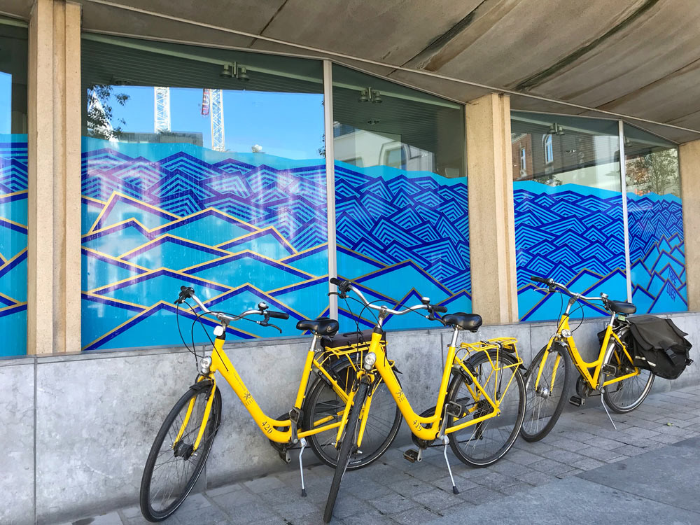
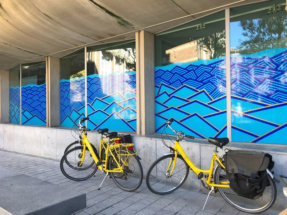
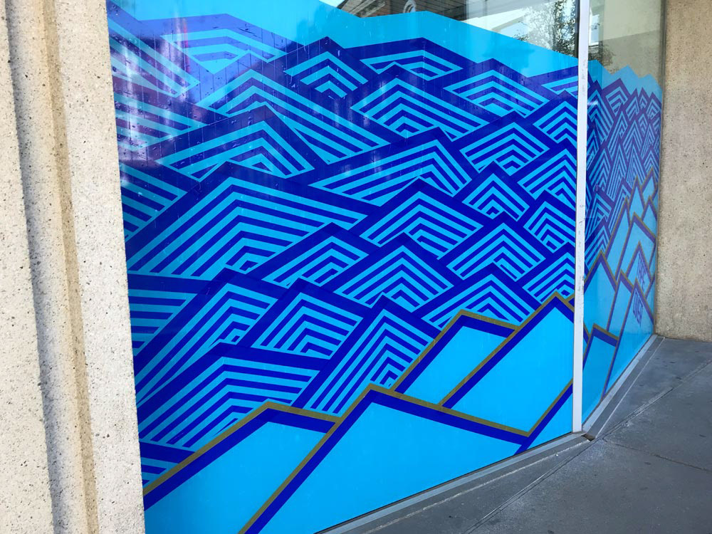
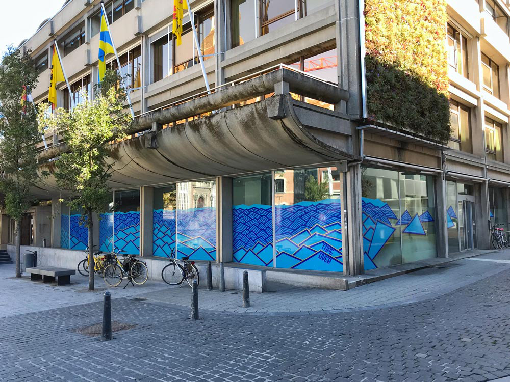
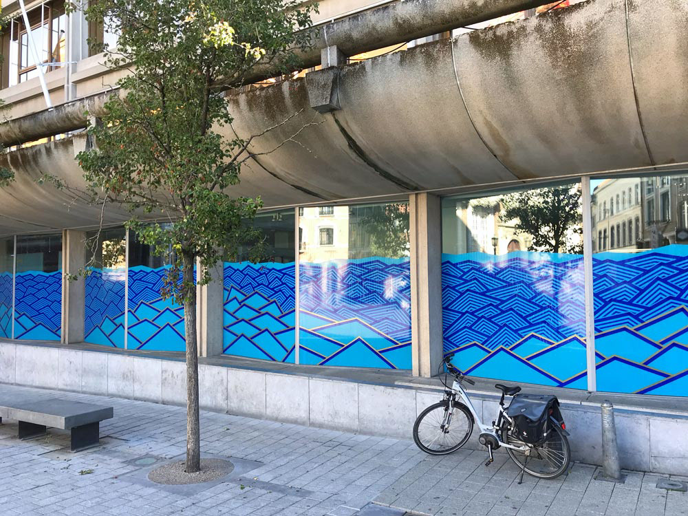
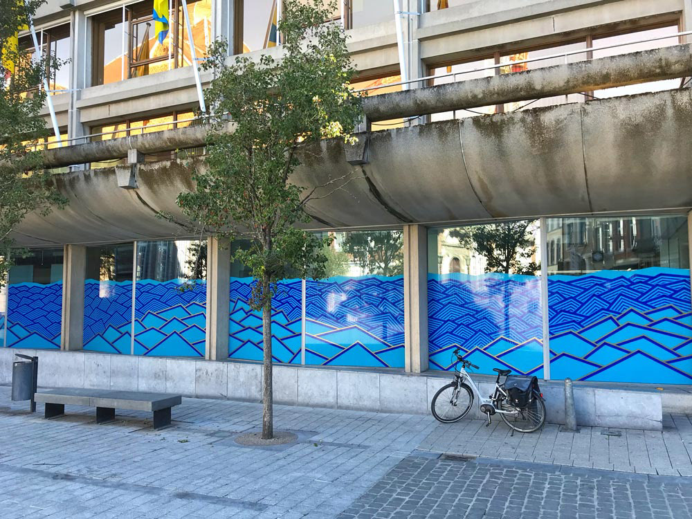
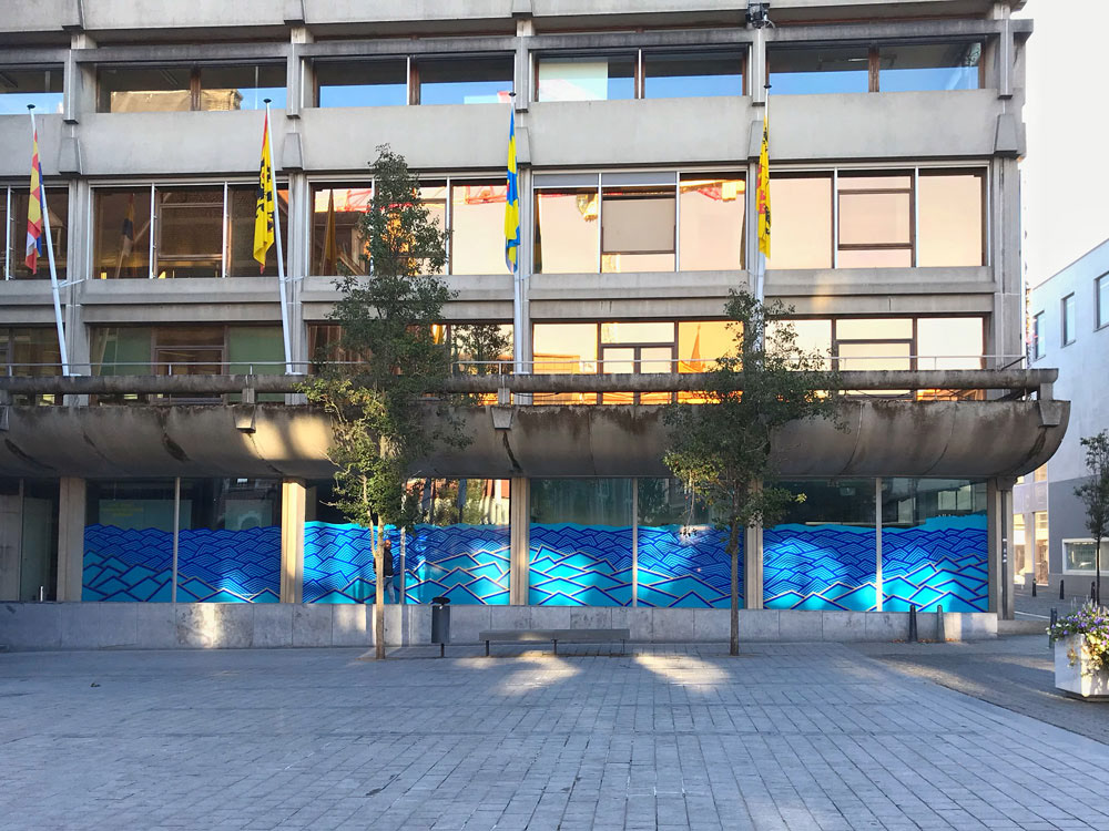
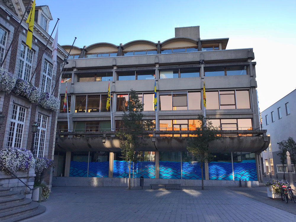
In the Dutch Hanseatic city of Hasselt, we took the architecture literally. We didn't use the striking glass facade at the "WATERFRONT" as a window to look through, but as a canvas to give the building a second skin.
The design is an abstract homage to the element of water that defines this city. We worked with opaque duct tape in various shades of blue to create a massive wave pattern. The challenge and appeal lay in the contrast of materials: the cold, smooth industrial glass meets the warm, fabric-like texture of the tape.
Instead of playing with translucency, we focused on visual presence. The blue lines flow organically across the rigid architecture, breaking the severity of the glass front. It is a rhythm of curves and currents that makes the building dynamic. The tape doesn't just block the view; it offers the eye something new: a frozen movement that visualizes the location's name - waterfront. We took the flow of the river and taped that energy onto the stationary glass.

In der niederländischen Hansestadt Hasselt haben wir die Architektur wörtlich genommen. Wir nutzten die markante Glasfassade an der „WATERFRONT“ nicht als Fenster, um hindurchzusehen, sondern als Leinwand, um dem Gebäude eine zweite Haut zu geben.
Das Design ist eine abstrakte Hommage an das Element Wasser, das diese Stadt prägt. Wir arbeiteten mit blickdichtem Gewebeband in verschiedenen Blautönen, um ein massives Wellenmuster zu erzeugen. Die Herausforderung und der Reiz lagen im Kontrast der Materialien: Das kalte, glatte Industrieglas trifft auf die warme, stoffliche Struktur des Tapes.
Statt mit Lichtdurchlässigkeit zu spielen, setzten wir auf visuelle Präsenz. Die blauen Linien fließen organisch über die harte Architektur und brechen die Strenge der Glasfront auf. Es ist ein Rhythmus aus Kurven und Strömungen, der das Gebäude dynamisch macht. Das Tape sperrt den Blick nicht einfach aus, es bietet dem Auge etwas Neues an: Eine gefrorene Bewegung, die den Namen des Ortes – Waterfront – sichtbar macht.