The Brief: For their presence at opti, the international trade show for optics and design, premium lens manufacturer ZEISS needed a booth concept that mirrored their core brand values.
The Task: An exhibition design that cuts through the visual noise of the convention hall. The goal was to communicate technical perfection through artistic minimalism, creating a sophisticated atmosphere for industry dialogue.
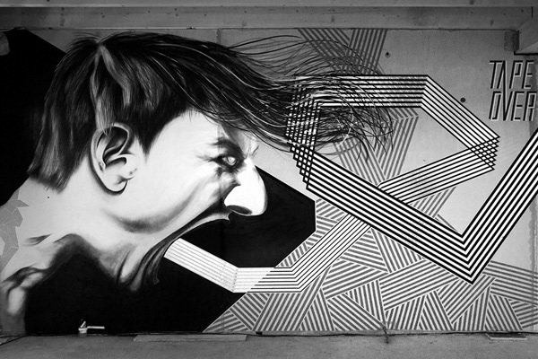
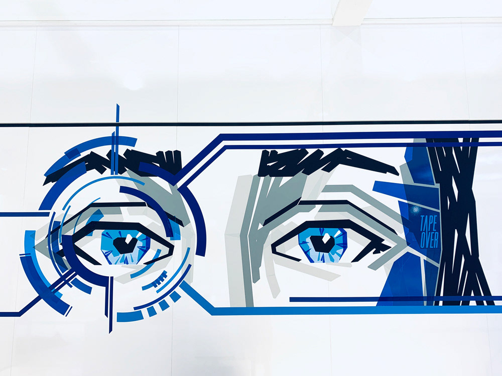
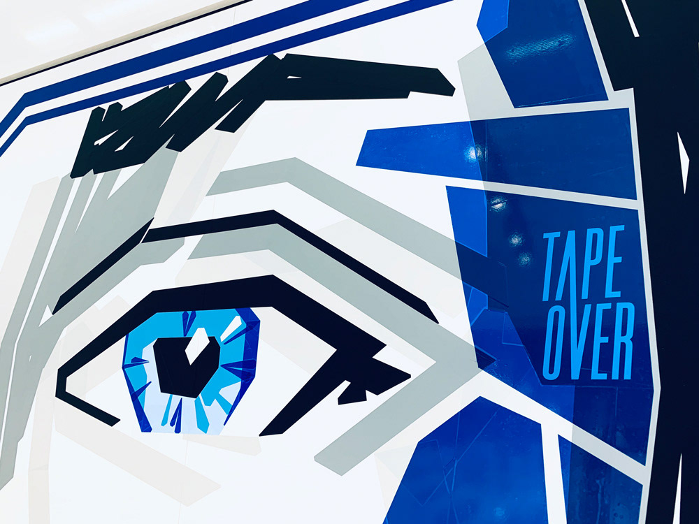
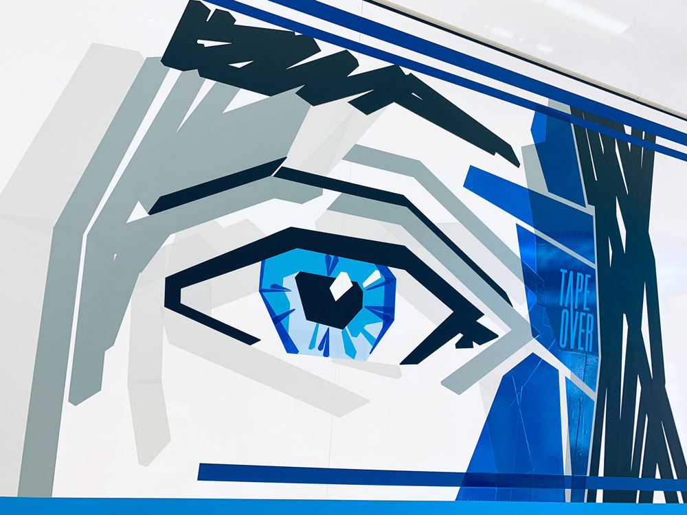
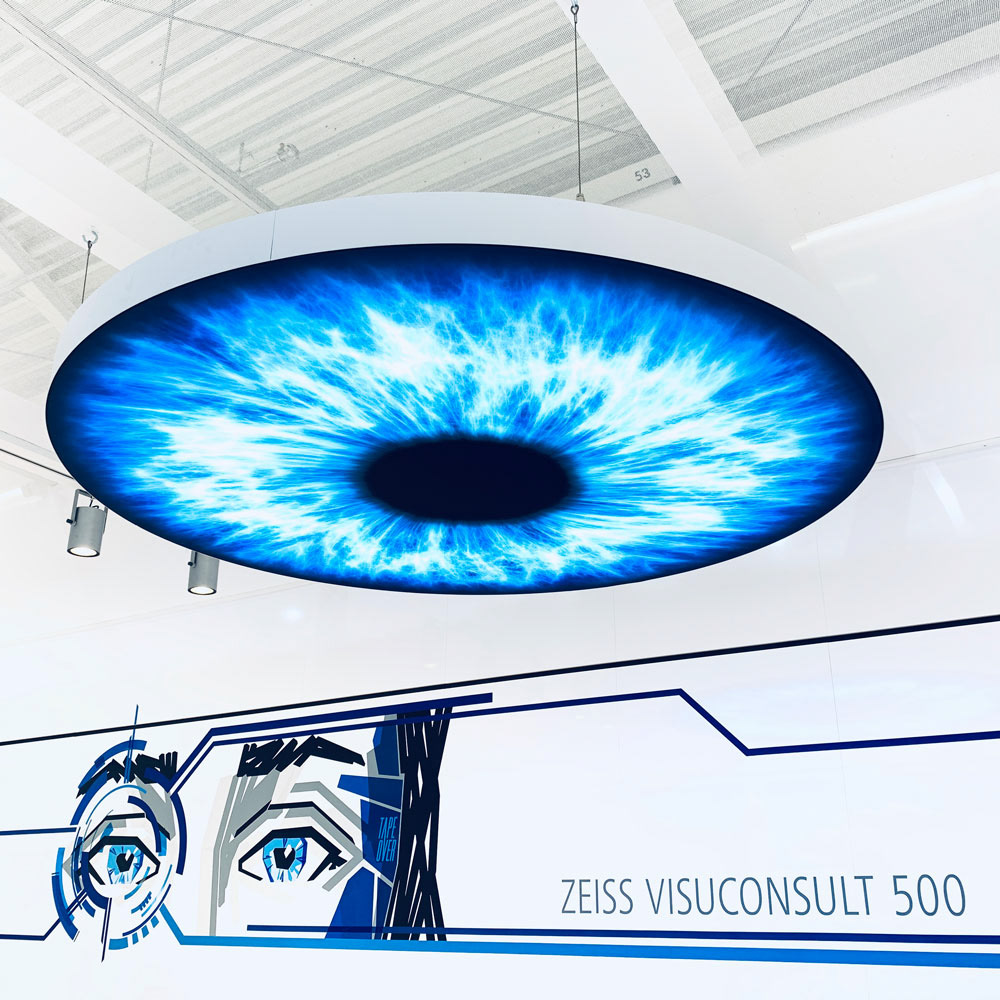
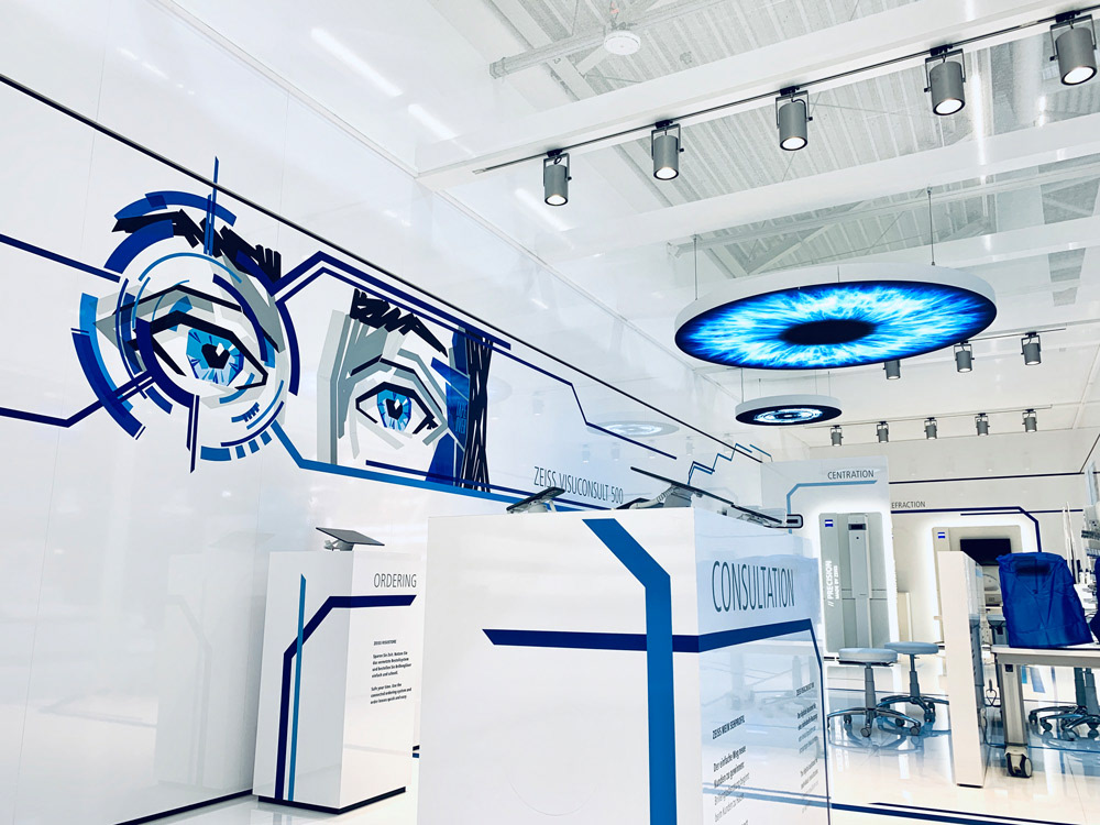
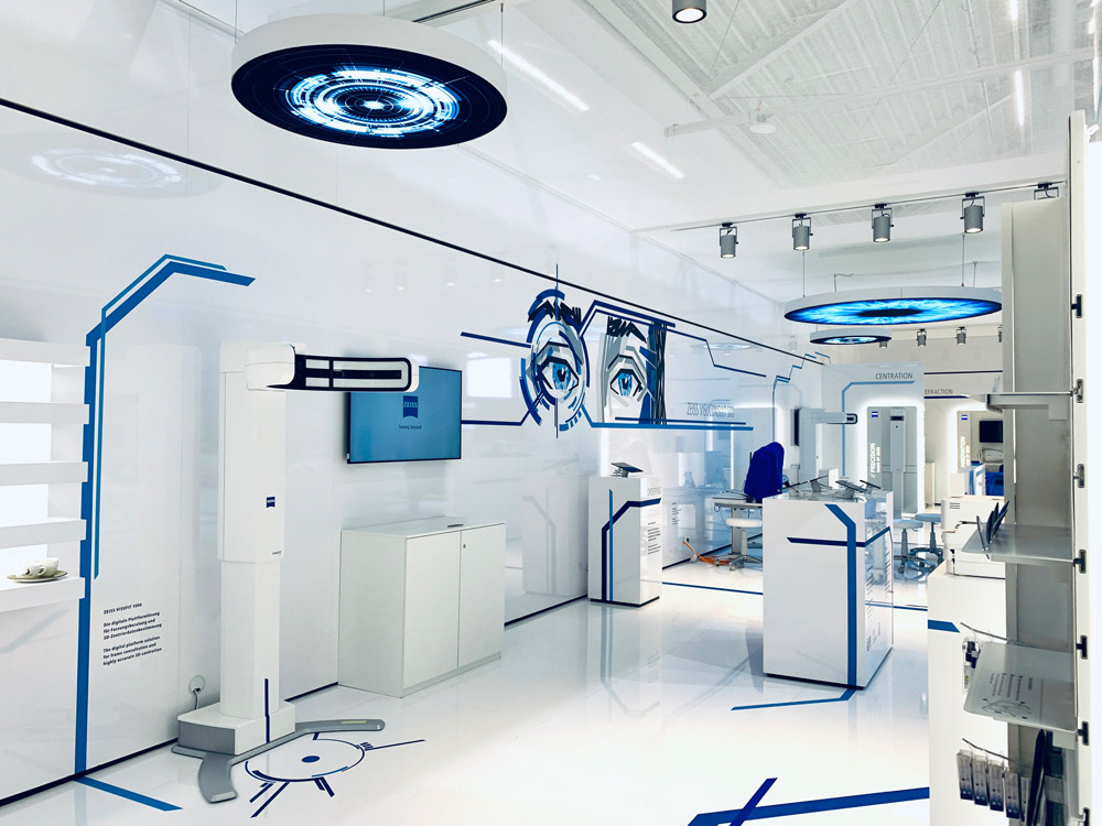
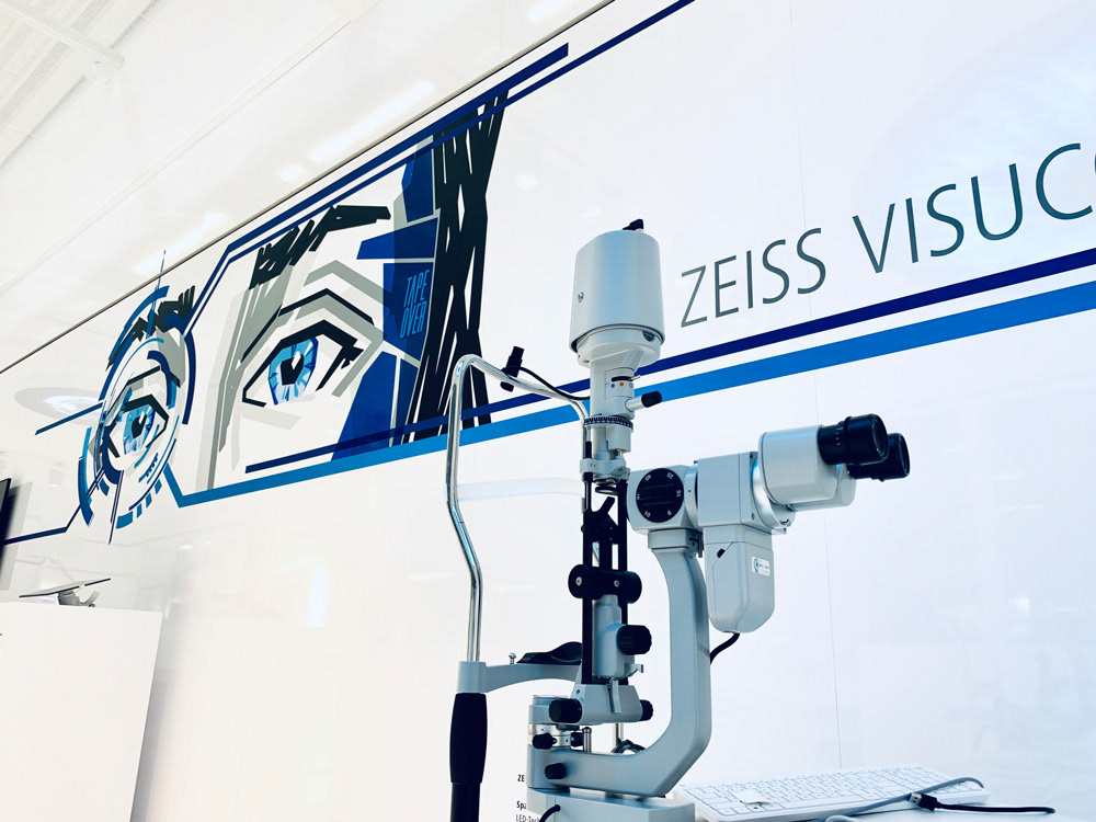
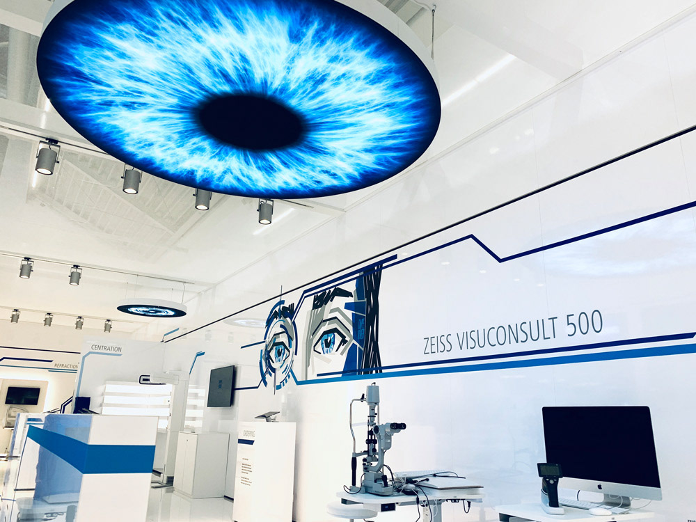
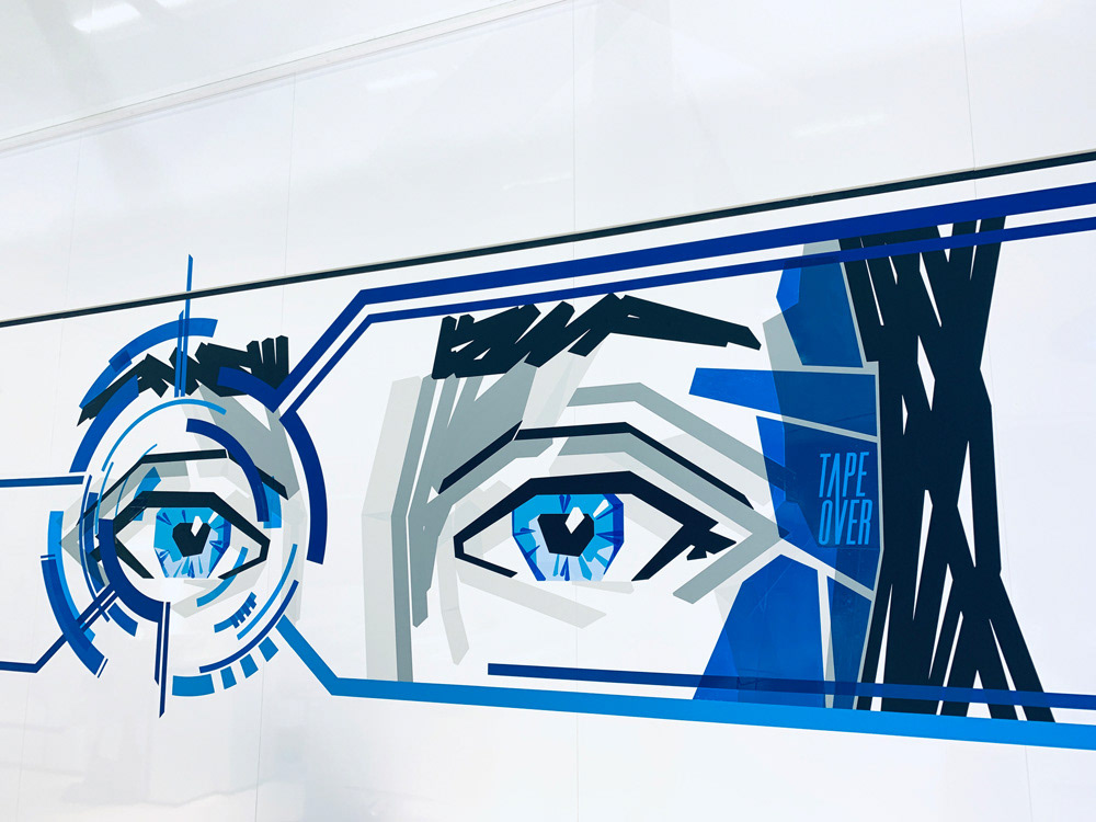
The Concept: TAPE OVER developed a design that strips the essence of optics - light and lenses - down to the bare essentials. Inspired by the aesthetic of a technical drawing or blueprint, the artwork visualizes the path of light through glass. We analyzed the complexity of a lens and taped that structure onto the wall. It is Corporate Branding that doesn't shout, but persuades through elegance.
The Execution: Using black and blue tape on pure white surfaces, we created clean lines with maximum contrast. The execution demanded absolute precision, as any deviation would have ruined the geometric rigor. The tapeart design feels almost architectural, subtly guiding the viewer's focus toward the product quality. The composition of lines and negative space establishes a perfect visual identity. We took the brand's standard for accuracy and tape that directly into the booth design.
The Outcome: A stand design that embodies quality and innovation. The fine lines underscore the high-end character of ZEISS precision lenses, proving at opti that sometimes, simplicity is the ultimate sophistication.
Das Briefing: Für den Auftritt auf der opti, der internationalen Messe für Optik & Design, benötigte der Premium-Glashersteller ZEISS ein Standkonzept, das die Kernwerte der Marke widerspiegelt.
Die Aufgabe: Ein Messebau, der sich vom visuellen Lärm der Halle abhebt. Es galt, technische Perfektion durch künstlerischen Minimalismus zu kommunizieren und eine ruhige, hochwertige Atmosphäre für Fachgespräche zu schaffen.
Das Konzept: TAPEOVER entwickelte ein Design, das die Essenz der Optik – das Licht und die Linse – auf das Wesentliche reduziert. Inspiriert von der Ästhetik einer Technische Zeichnung oder eines Bauplans, visualisiert das Artwork den Weg des Lichts durch das Glas. Es ist Corporate Branding, das nicht schreit, sondern durch Eleganz überzeugt. Die Visuelle Identität von ZEISS wird hier nicht gedruckt, sondern geklebt.
Die Umsetzung: Auf reinweißen Flächen kamen schwarze Tapes zum Einsatz, um Klare Linien mit maximalem Kontrast zu erzeugen. Die Umsetzung erforderte absolute Präzision, da jeder Millimeter Abweichung die geometrische Strenge zerstört hätte. Das Design wirkt fast Architektonisch und lenkt den Fokus des Betrachters subtil auf die Qualität der Produkte. Die Komposition aus Linien und Leerraum schafft eine Balance zwischen Kunst und Information.
Das Ergebnis: Ein Tapeart-Standdesign, das Qualität und Innovation verkörpert. Die feinen Linien unterstreichen den High-End-Charakter der ZEISS-Präzisionsgläser und beweisen auf der opti, dass weniger oft mehr ist.